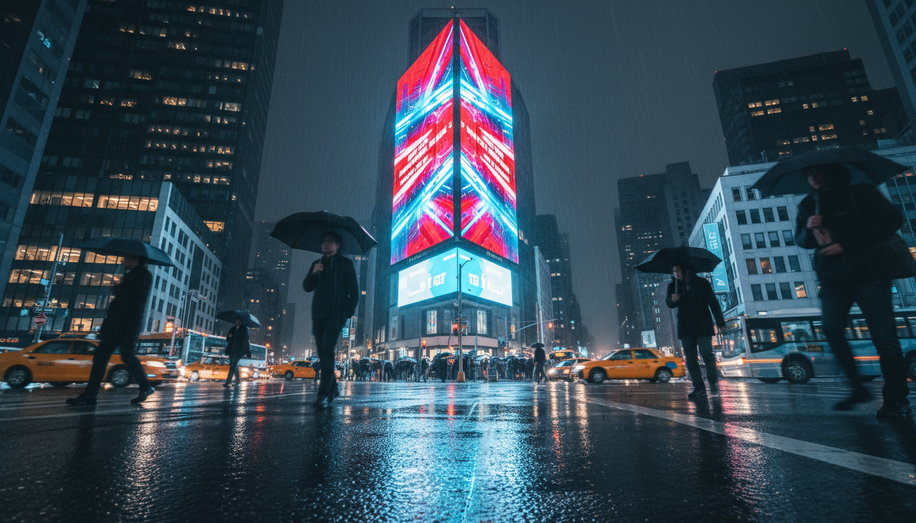
Color is far more than aesthetic window dressing in out-of-home advertising—it’s a psychological tool that shapes how consumers perceive brands and respond to messages within seconds. As advertisers compete for attention in increasingly cluttered environments, understanding how different hues influence emotion and behavior has become essential to campaign success.
The science behind color psychology reveals that specific colors trigger predictable emotional and behavioral responses. Red, for instance, commands immediate attention and conveys urgency or excitement, making it the go-to choice for clearance sales and time-sensitive promotions. Blue, by contrast, evokes feelings of calm, trust, and professionalism, which explains why corporate brands and financial institutions gravitate toward this hue to instill confidence in their services. Yellow radiates cheerfulness and friendliness, often used to create positive associations with consumer products. Green connects to health, nature, and tranquility, resonating particularly well with environmentally conscious audiences and wellness brands.
The strategic application of these colors directly impacts brand recognition and consumer behavior. Research demonstrates that colorful visuals can increase engagement by up to 80% compared to monochromatic designs. McDonald’s iconic red and yellow combination exemplifies this principle—the red grabs attention while yellow triggers appetite and happiness, creating a powerful psychological hook that drives consumer response. Similarly, Coca-Cola’s signature red conveys energy and boldness, becoming so synonymous with the brand that it serves as instant recognition across global markets. Facebook’s use of blue establishes a sense of safety and connection, while Whole Foods’ green branding reinforces its commitment to natural and organic products.
Beyond individual color selection, the effectiveness of out-of-home advertising depends on how colors interact through contrast and visibility. High-contrast combinations—such as white text on black backgrounds or yellow text on dark blue—significantly enhance readability at distance, a critical consideration for billboards that audiences view in seconds while moving. This contrast doesn’t merely improve legibility; it enhances cognitive processing, allowing viewers to absorb information faster and retain it longer. Studies show that people recall colorful advertisements better than monochromatic ones, even days after exposure.
Demographic considerations add another layer of complexity to color strategy. Gender preferences influence color perception and response, with research suggesting that women often respond positively to soft pinks and light blues that evoke warmth and approachability, while men tend to gravitate toward bolder, more saturated colors like navy blue or deep red that convey strength and assertiveness. Age also plays a role; younger audiences are drawn to colors reflecting energy, creativity, and individualism. Successful campaigns align color choices with target audience preferences while reinforcing brand identity and core messaging.
Environmental conditions further shape color effectiveness in outdoor settings. Summer brightness, glare, and ambient heat alter how audiences perceive color, requiring advertisers to adjust their palettes accordingly. Warm colors—reds and oranges—excel at creating urgency and enthusiasm, making them ideal for seasonal promotions and events. Cooler colors like blues and greens foster calmness and trust, positioning them as optimal choices for health, wellness, and financial sectors. A campaign promoting a wellness retreat might deploy soothing greens and blues to instill peace and relaxation, psychologically inviting consumers to envision tranquility.
The emotional connections fostered through strategic color use extend beyond immediate attention capture. Colors create psychological bonds with consumers, increasing brand recall and loyalty. When color choices align with brand values—such as a sustainability-focused company using green and earthy tones—consistency across marketing platforms strengthens brand recognition and consumer trust.
For out-of-home advertisers seeking maximum impact, testing color combinations in real-world environments remains essential. The interplay between color psychology, target demographics, environmental conditions, and brand messaging determines whether an advertisement merely appears or truly resonates. In an attention economy where billboards have mere seconds to influence perception and behavior, the right color strategy transforms advertising from background noise into memorable, action-driving communication.

